Sometimes we have to add multiple borders. We use multiple HTML tags or before/after CSS pseudo-elements in this case.
But now we are going to show something special.
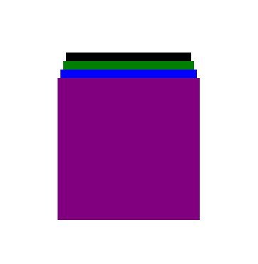
1: First, we have to take an HTML tag.
<div class=""></div>
div{
  width:200px;
  aspect-ratio: 1 / 1;
  background: purple;
  position: fixed;
  inset: 0;
  margin: auto;
  box-shadow:
    0 -16px 0 -4px blue,
    0 -32px 0 -8px green,
    0 -48px 0 -12px black;
}
2.1: (width: 200px) this is the element width.
2.2: (aspect-ratio: 1 / 1) this means the element area will be the same as the width the first value is the width and 2nd value is for height. We can use only one value for a square.
2.3: (background: purple) this is a simple background.
2.4: (position: fixed) this is the position property, but in this case, this has to use to place the box in the center.
2.5: (inset: 0) this property actually makes the element on full viewport. But we have a fixed height/weight, so we can’t see any changes. Because this property calculates the horizontal and vertical sides, the next property will work based on it.
2.6: (margin: auto) we know the margin: auto work only for horizontal but, because we use the “inset” property with a “0” value, it will work for vertical too.
2.7: (box-shadow) normally, box-shadow works as a shadow that always exist behind each element. We are just trying to show that. In a box-shadow property, the 1st value is for horizontal distance, the 2nd value is for vertical distance, the 3rd value is for the blurry effect, and the 4rth value is the area before the blurry area start.
In this case, we use “-16px” blue to show the shadow at the top of the box and compressed it “-4px” from all sides.
Hi i think that i saw you visited my web site thus i came to Return the favore Im attempting to find things to enhance my siteI suppose its ok to use a few of your ideas
Somebody essentially lend a hand to make significantly articles Id state That is the very first time I frequented your website page and up to now I surprised with the research you made to make this actual submit amazing Wonderful task